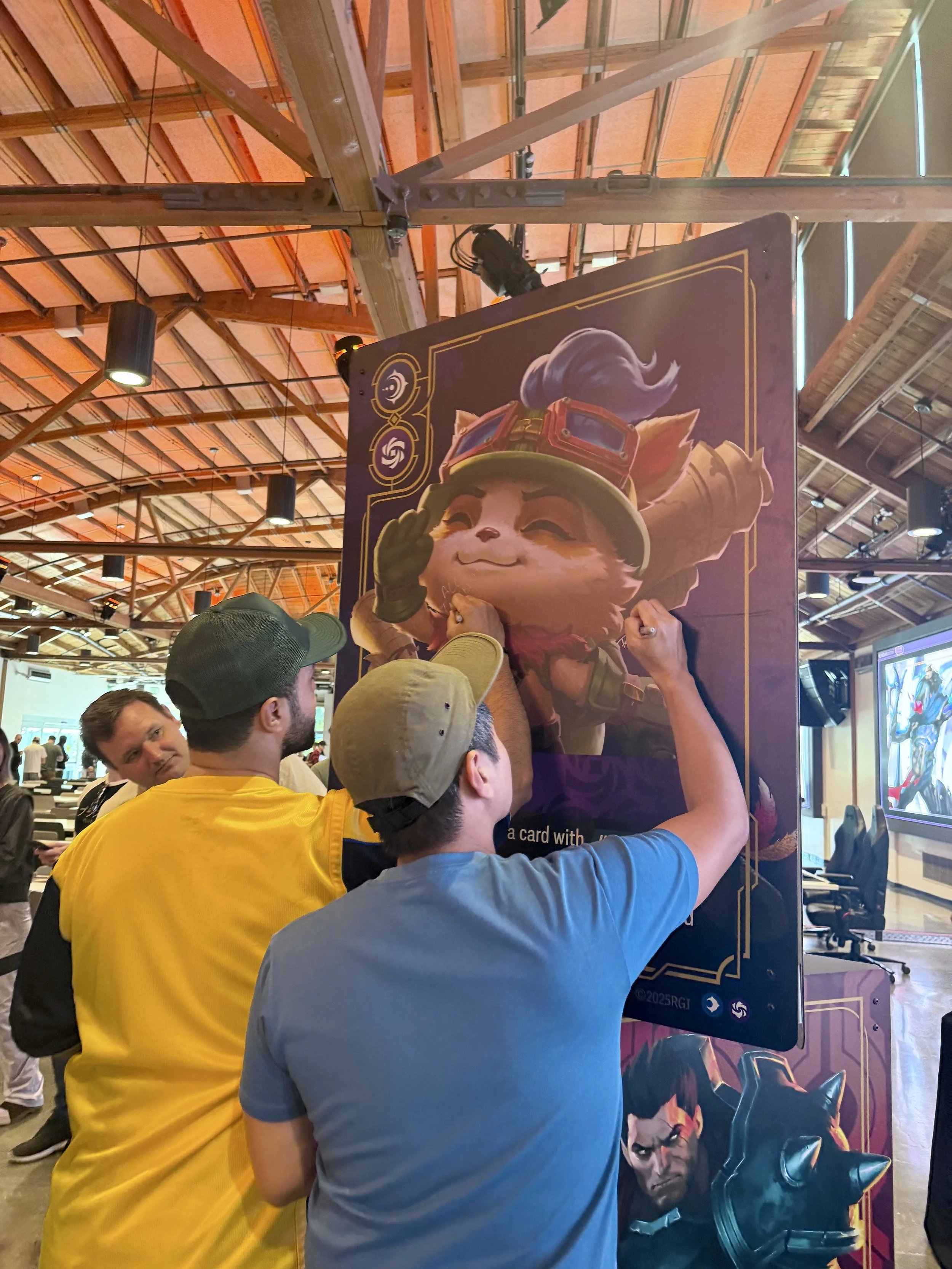



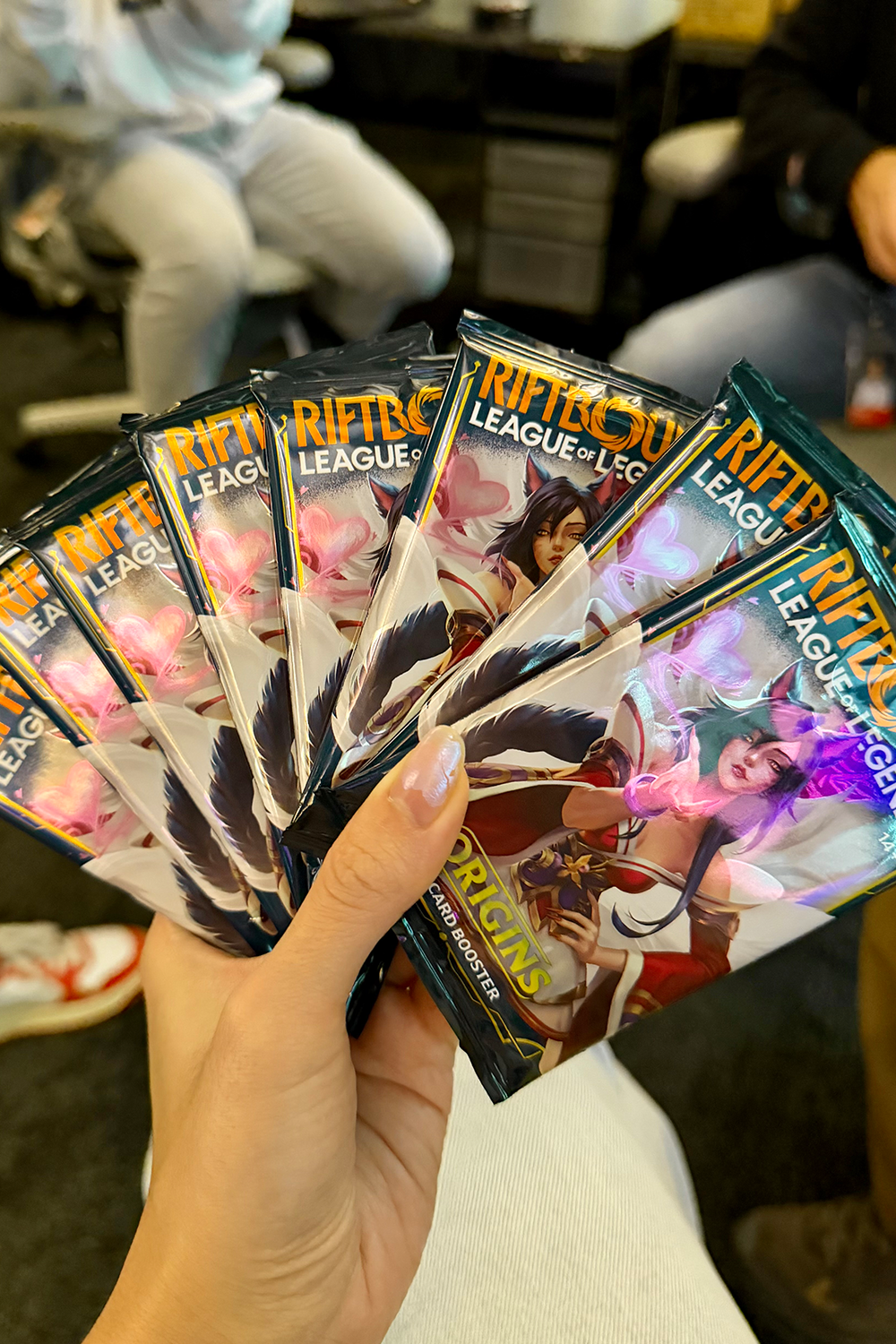
Riftbound | League of Legends Trading Card Game
game UI, systems, branding
As part of Riftbound’s Art Strike Team, I co-led the redesign of the game’s foundational card system. My work defined the UI’s visual language from the ground up and shaped the look and feel of Set 1, Origins — the game’s first globally released set.
role / Visual Design Artist III
company / Riot Games
At the start of development, codenamed Project K was a card game with simple designs built for a limited release. But as the game’s potential became clear, it became obvious the existing card system wouldn’t scale. To prepare for a worldwide launch, we needed to rethink the entire visual foundation—building a TCG that balanced art and functionality while feeling like a natural extension of the League of Legends universe.
Our early phase was defined by rapid, daily iteration. Working closely with game designers, producers, and playtesters, we explored everything at once: layout, iconography, color systems, hierarchy, frame shape language, rarity and more.
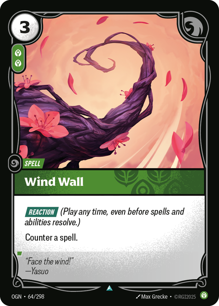
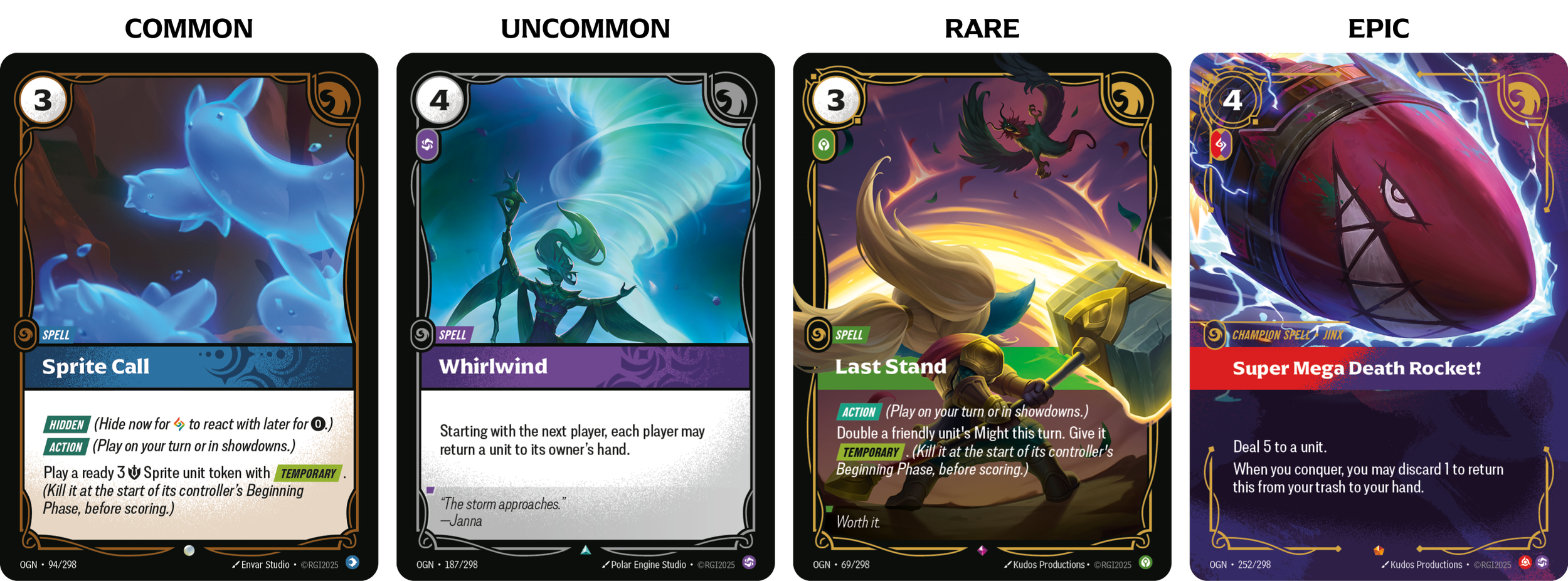
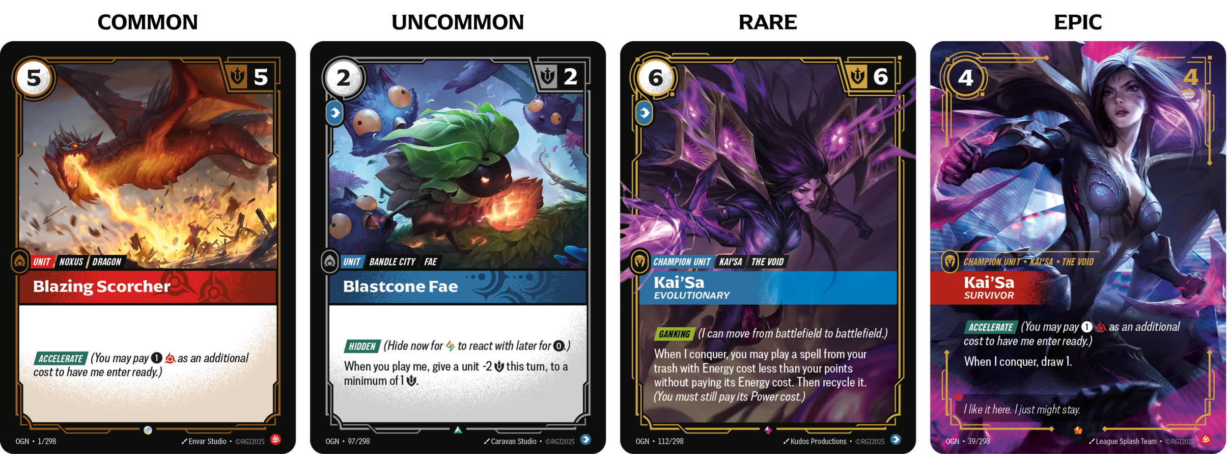
The card frames are a core element of Riftbound’s card system. They define card type and rarity, and the following examples show how frames progress across gear, spells, and units. Drawing from Hextech, the designs weave seamless lines of energy and magical craftsmanship into a visual language that delivers clarity without compromising artistry.
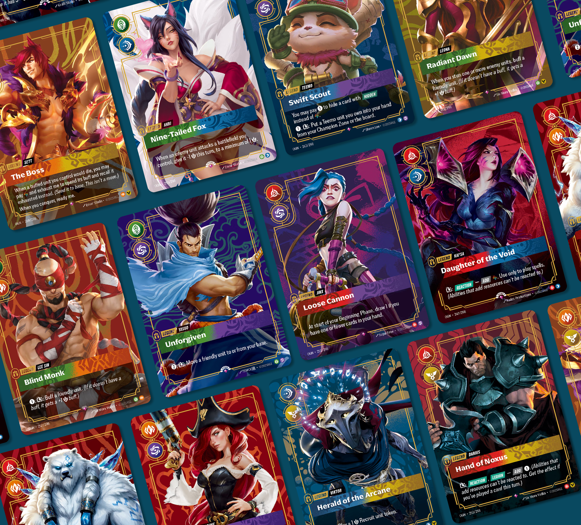
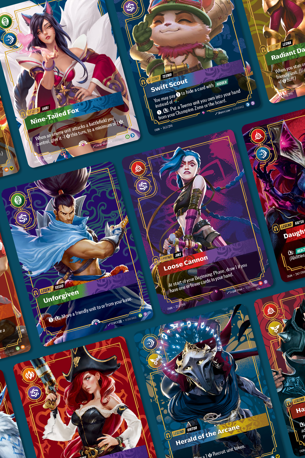
Each Legend card was composed and painted by hand, with intentionally placed airbrushed strokes bringing depth to the patterns and UI.
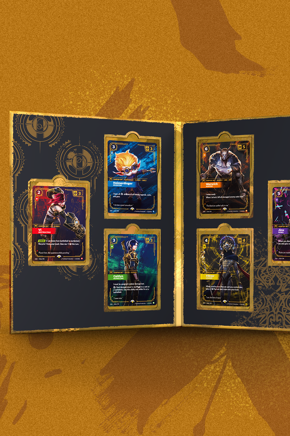
Packaging design for the Riftbound x Arcane box set.

